
When we decided to rebuild the MM Shopy Devs website, we set ourselves a harder goal than "make it look nice." We wanted pixel parity with our Figma designs, a custom CMS our whole team could use, three languages, and an AI (Claude) doing the heavy lifting of the build. Our own site became the test bench for a workflow we now use with clients.
This is an honest account of what worked, what broke, and what we'd tell anyone attempting the same. It's also an honest answer to everyone still claiming "we just build it in Claude with a few prompts." Trust us, that is not the case.
Step one: the CMS
The first step was building the CMS itself, with backend controls and a visual editor. Our team lives and breathes Liquid, so we used it as the base templating language.
The results were outstanding. Claude did a genuinely impressive job building it, but we can guarantee it was not a "few days" job. It took many, many iterations and steps. And here's the thing: this wasn't even the most technically complex part of the build. You do need to be technically prepared, know exactly what to ask for, and bring a 360-degree understanding of the field. But the real challenge came later.
Step two: design and testing
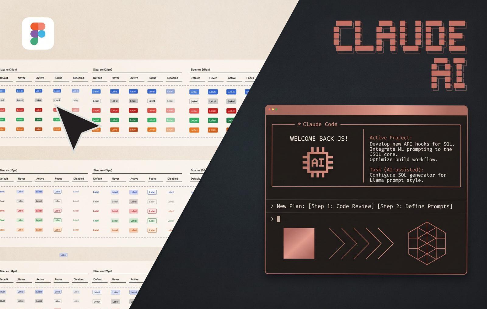
Everything starts in Figma, exactly as in our Shopify website design projects, built as a real design system: components, variants, and variables, not loose frames. Our UX Designer builds desktop and mobile as separate, deliberate designs with their own type scales.
Why Figma and not Claude Design? Simple: we wanted to reproduce what our real Shopify clients will demand, which is consistency and a scalable design system, and today only Figma can provide that.
The idea sounds straightforward: Claude reads the file directly through Figma's API and MCP integration and builds it into the CMS. In practice, this was the true challenge, and where we spent most of our time testing, looping, and testing again.
It's also where our UX Designer had to work hardest. Not on how the designs looked, but on how they were built. We went through many loops of exporting and importing into the CMS to verify what Claude can actually read, what it can't, and where corrections were needed.
Components are the keyword. To build precisely, the most important thing is components and how they're structured. Then we discovered that how a design is technically constructed matters enormously: what is contained inside what, how each container is set, and so on. Honestly, very few designers go into this level of detail when building in Figma. In our experience it's genuinely uncommon. But when working with AI, element hierarchy and correctly applied styling rules are among the key factors in getting Claude to understand how each element should behave.
Then come annotations, another essential tool that lets you tell Claude "this element must behave like this, it needs this set of controls," and so on. Without annotations, Claude is blind. But be careful: it's very easy for annotations to contradict the design, and they must never be used as a shortcut to avoid setting the design up correctly.
We could write an entire article about what we discovered at this stage alone. In short: this is not a straight design-and-deliver process. The designer must know exactly what they're doing and correct course as they go.
Challenge one: the result differs from the design
This is where we banged our heads the most. The design is perfect, Claude has all the correct information and can read everything. So why is what it builds different?
We have to be honest here: we didn't find a way to eliminate this. Claude will always differ from the design, sometimes by a small percentage, sometimes by a larger one.
So how did we solve it? "Simple": we built a QA gate system. Claude builds, then the build is reviewed against the design (and trust us, this gate runs close to a hundred rules and checks), then mistakes are fixed automatically, and finally the source of each mistake is traced and turned into a new rule so it can't happen in the next build.
It sounds simple. This point alone took us weeks of testing before we nailed it. We built it so that after every first build we can measure the percentage of difference from the design, and we can guarantee it's never under 10%. Without a proper QA gate (a complex one, combining several QA methodologies), Claude is simply not precise.
Some readers may think: 10% is fine. Well, it depends. Our developers are pixel-perfect, and the clients we work with expect exactly that. A 10% deviation spread across every page creates a cascade of feedback and issues we simply can't afford.
Challenge two: code blobs
This is what scared us most once we started reading the actual code Claude produced.
We discovered something interesting: a page can be pixel-perfect against the mockup and look flawless at first glance. But open the code and you find everything done in inline CSS, or hundreds of classes created one per element. For those who don't know: visually, this produces the same result. Technically, it's a huge mess and a performance disaster.
The reason is quite simple: Claude can't standardize design tokens for you if you haven't done it first. This goes back to the design rules, but it goes beyond them. The entire design must use design tokens, with standardized properties as variables.
And this is what worried us most. We're experts, so we detect this quickly. But everyone out there shipping Claude-built production sites, we're fairly sure most of them are not checking this.
What we actually learned
The AI isn't the quality system. The process is. Claude is remarkably fast and genuinely good at translating a well-structured Figma file into clean code. But speed without gates just produces wrong answers faster. The combination that works is: a disciplined design file, an AI that reads data rather than pictures, automated checks that don't negotiate, and a human who still reviews every page against the mockup.
Root causes over patches. When something regressed, we traced it to the structural cause and fixed that, usually turning it into a new gate. Patching symptoms is how a codebase rots quietly.
Design systems pay off twice. Every hour our designer spent on clean components and variables in Figma saved multiples of that in the build, because clean input is the single biggest lever on AI output quality.
The site is live now, trilingual, CMS-driven, pixel-checked, and the same pipeline is becoming the foundation for how we build for clients. If you're a brand or an agency thinking about AI-assisted builds, get in touch and we'll talk about what this looks like applied to your project.